Design new digital touchpoint that matter for Thai leading credit card
Year:
2021
Role:
Experience Designer
Design At
Ogilvy
Design for
Krungsri Consumer

Krungsri Consumer, a biggest player in Thailand’s financial sector, is a subsidiary of Bank of Ayudhya (Krungsri) and operates under the Mitsubishi UFJ Financial Group (MUFG), one of the world’s largest financial institutions. It is the leading provider of credit card services in Thailand, holding the largest market share with over nine million accounts. The company offers a wide range of credit cards, catering to different customer segments, including premium, lifestyle, cashback, and co-branded cards with major retailers and service providers.
As part of MUFG, Krungsri Consumer benefits from advanced global banking expertise, allowing it to implement cutting-edge financial technologies and enhance customer experience. The company has been at the forefront of digital innovation, with initiatives such as the UCHOOSE mobile app, which enables users to manage their credit cards, make payments, and access personalized financial insights. This digital-first approach has contributed to a rise in online credit card applications, making it easier for customers to access financial products.
With its robust portfolio, strategic innovations, and affiliation with MUFG, Krungsri Consumer continues to dominate Thailand’s credit card market, offering customers secure, flexible, and digitally enhanced financial solutions. Its leadership in the sector is a testament to its commitment to financial excellence and customer satisfaction.

Krungsri Consumer, a subsidiary of Bank of Ayudhya (Krungsri), offers a variety of financial products and services in Thailand. Key brands and subsidiaries under Krungsri Consumer include:
These brands operate under the Krungsri Consumer umbrella, delivering a comprehensive range of financial products and services to meet the diverse needs of customers in Thailand.
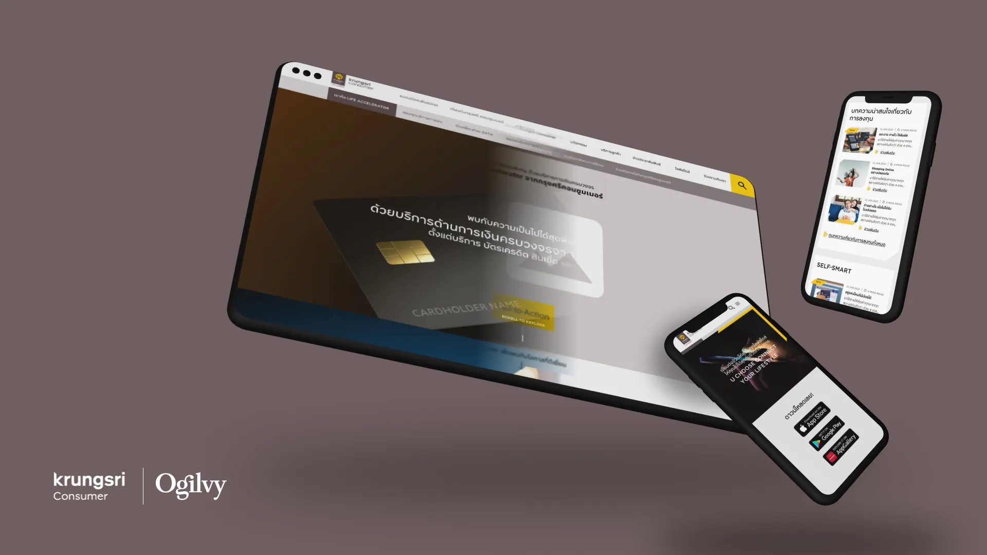
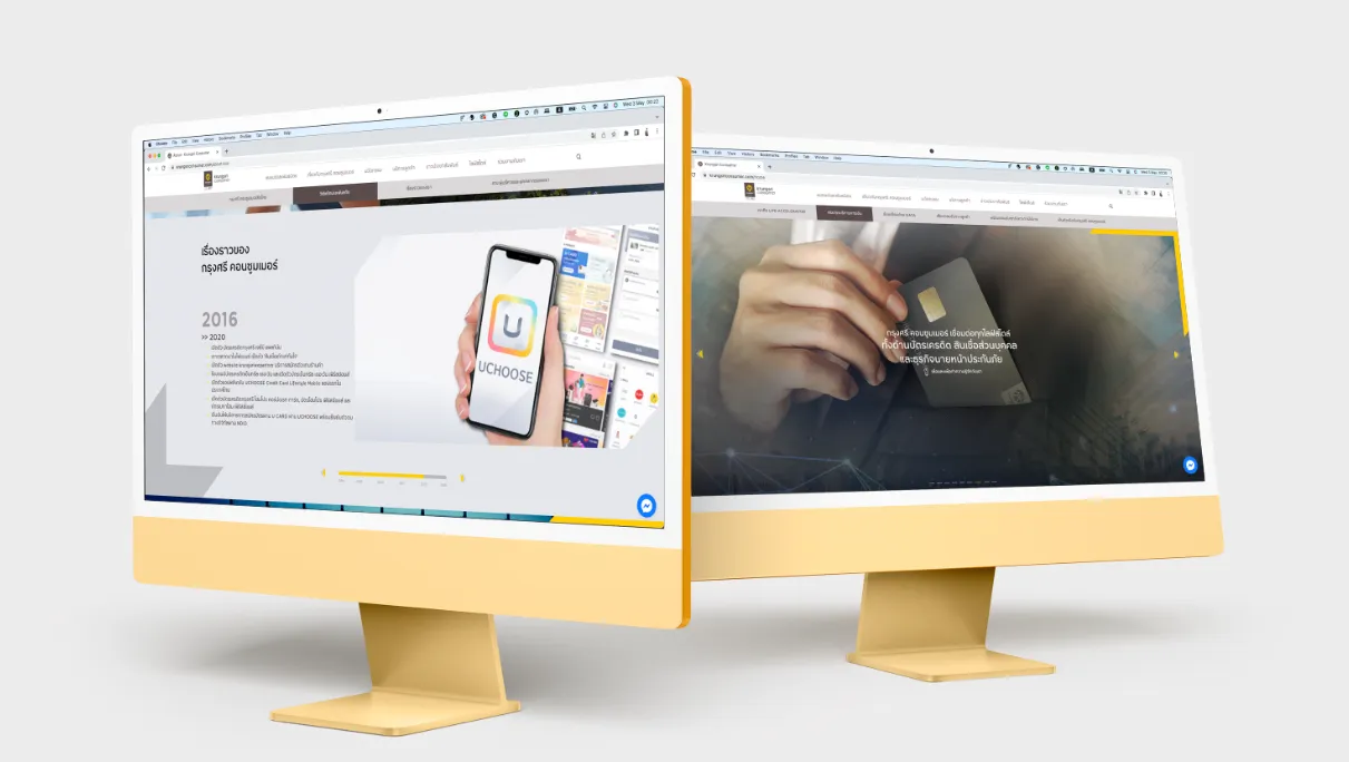
Ogilvy Thailand was tasked with redesigning Krungsri Consumer’s (KSC) corporate website to address a key challenge: while customers recognize the brand, they often do not associate it with its parent company or understand its connection to KSC. The top management believes that launching a new website will bridge this gap and strengthen brand awareness.
As the designer of the Customer Experience (CX) team who led on this project, I recognize that simply having a website is not enough, it must be a site that makes sense. A well-designed digital touchpoint should not only inform users but also seamlessly integrate into their journey with the brand.
My approach goes beyond aesthetics. I focus on ensuring that the website is a strategic touchpoint in the customer journey, reinforcing brand relationships while serving essential corporate functions. The redesigned website will function as more than just a digital brochure; it will serve as a hub for public relations, job opportunities, corporate insights, and other key interactions.
By aligning user experience design with business objectives, this new website will not only solve the brand association challenge but also enhance how customers engage with Krungsri Consumer at every level.
The challenge isn’t just creating a website, it’s about sense-making: designing a digital touchpoint that clearly communicates Krungsri Consumer’s connection to its parent company while seamlessly fitting into the customer journey and serving essential corporate functions.
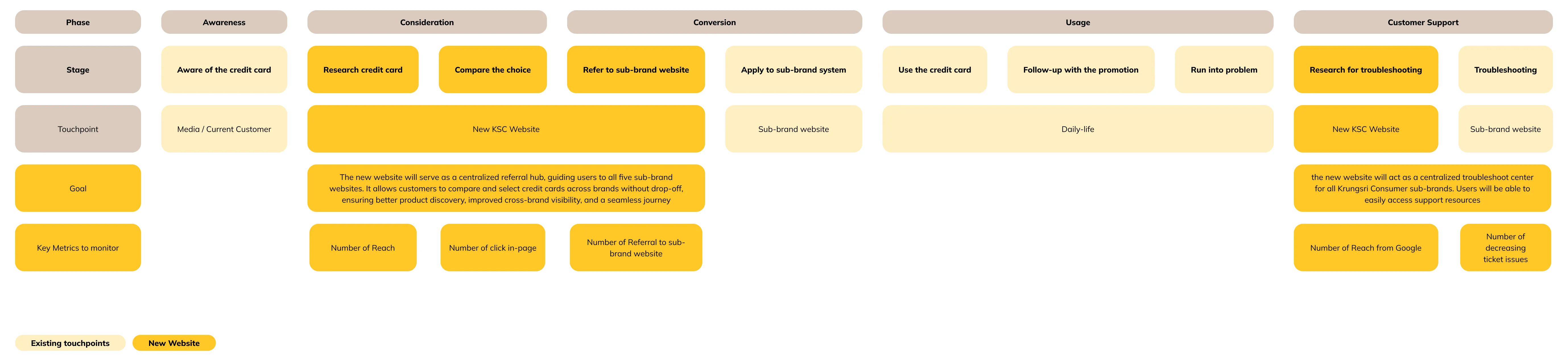
The new website will function as a centralized referral portal, seamlessly connecting users to all five sub-brand websites under Krungsri Consumer. Instead of forcing users to navigate through fragmented entry points, the site will provide a unified, brand-agnostic experience—allowing customers to browse, compare, and choose credit cards across all KSC sub-brands in one place.
By doing so, it helps address the current drop-off problem where users land directly on a sub-brand site, explore only a limited set of options, and remain unaware of potentially better-suited products offered by sister brands. With an integrated comparison tool and smart recommendation engine, the new site will guide users to the most relevant credit card for their lifestyle and financial goals—regardless of brand ownership.
This approach not only enhances cross-brand visibility and product discovery, but also supports business goals by increasing conversions, reducing fragmentation, and offering a more strategic customer journey that keeps users within the Krungsri Consumer ecosystem.
In addition to serving as a referral hub, the new website will act as a centralized troubleshoot center for all Krungsri Consumer sub-brands. Users will be able to easily access support resources such as FAQs, contact information, live chat, and self-service tools—regardless of which brand they hold a card with. This unified support experience reduces confusion, eliminates the need to navigate multiple brand sites, and ensures that customers can resolve issues, check application status, or find answers quickly and confidently, all in one place.
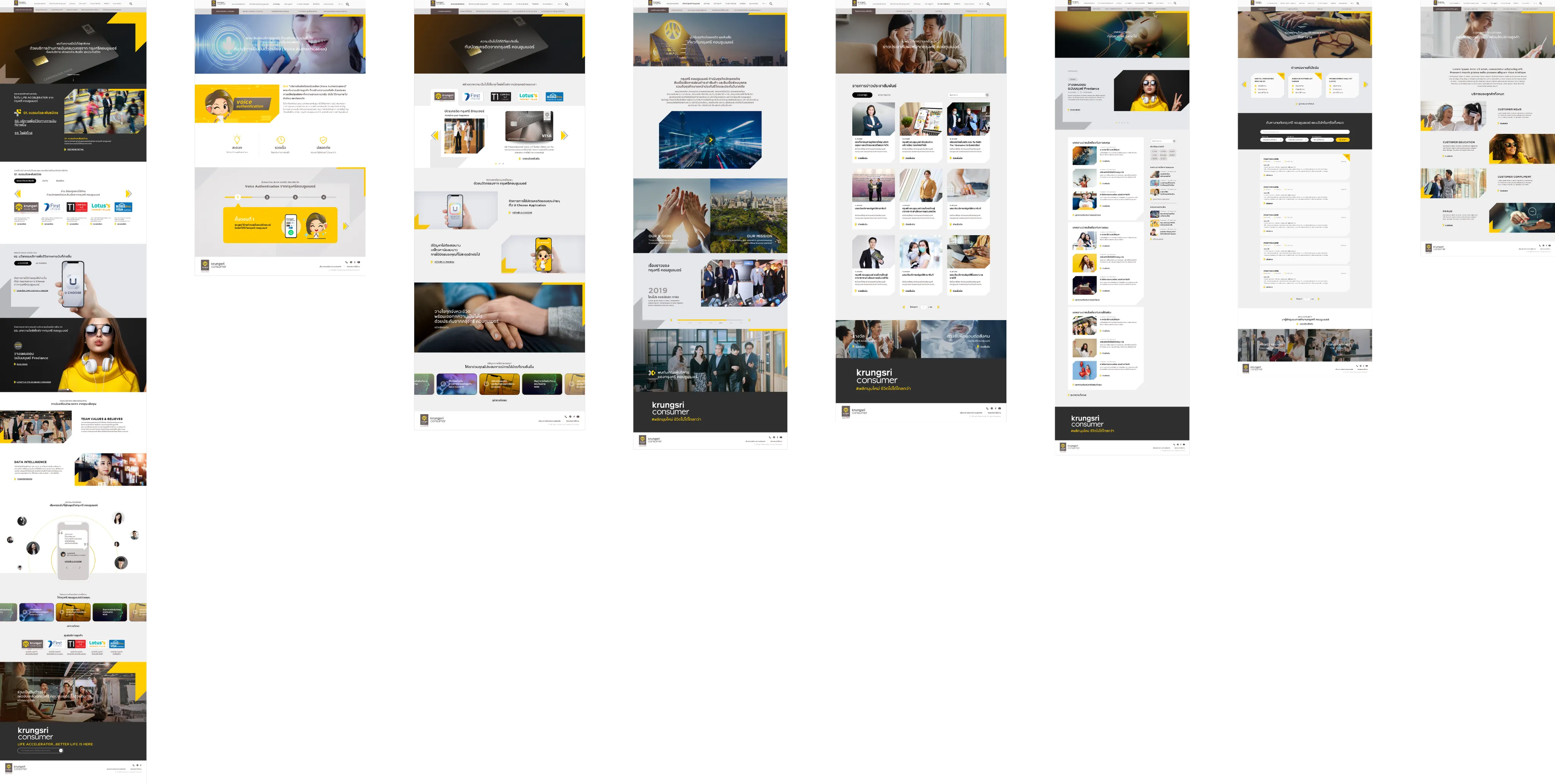
To emphasize Krungsri Consumer’s brand value, the new website will also feature lifestyle-driven content that promotes financial literacy through engaging blog articles, tips, and real-life spending guides tailored to different customer segments. This not only builds trust and positions KSC as a helpful financial partner, but also enriches the user journey beyond product offerings. Additionally, the site will serve its role as a standard corporate website, hosting essential sections such as company profile, leadership, press releases, investor relations, and career opportunities—ensuring it meets both business and stakeholder expectations while reinforcing the credibility and identity of Krungsri Consumer as a leading financial services provider.
The corporate portion of the website is not just about telling the story of the company—it’s designed to embody Krungsri Consumer’s strength, innovation, and credibility.
Through clear communication of its leadership, technological advancements, and strategic alignment with MUFG, this section aims to build trust with customers, showcasing the organization as a forward-thinking, stable, and customer-centric financial partner. It reinforces the idea that behind every credit card or service is a company with vision, integrity, and proven expertise, ultimately deepening customer confidence in choosing KSC.
The visual design of the new Krungsri Consumer website was brought to life in close collaboration with the UI team at Ogilvy. While I led the UX and experience strategy, Ogilvy’s UI specialists translated those foundations into a visually cohesive, modern, and brand-aligned interface.
Their role was critical in shaping a design language that could support a content-heavy and multi-functional platform, while still feeling light, intuitive, and trustworthy. The team crafted modular components, a refined visual hierarchy, and a color system that reflected Krungsri Consumer’s brand identity, yet remained adaptable across all sub-brands and customer segments.
Working closely together, we ensured that the visual design supported scroll-based interaction patterns, scrollytelling elements, and clear readability across devices. The result is a website that not only functions well, but feels polished, modern, and aligned with KSC’s forward-thinking positioning within Thailand’s financial landscape.


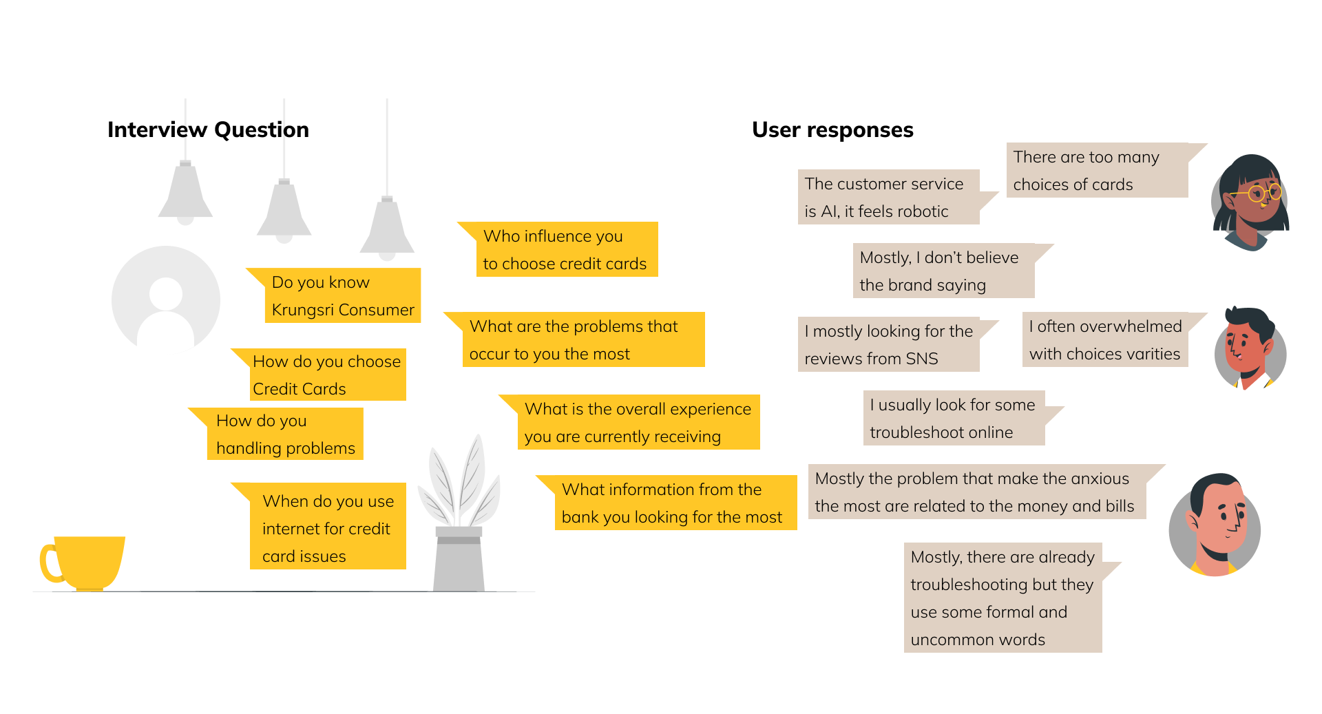
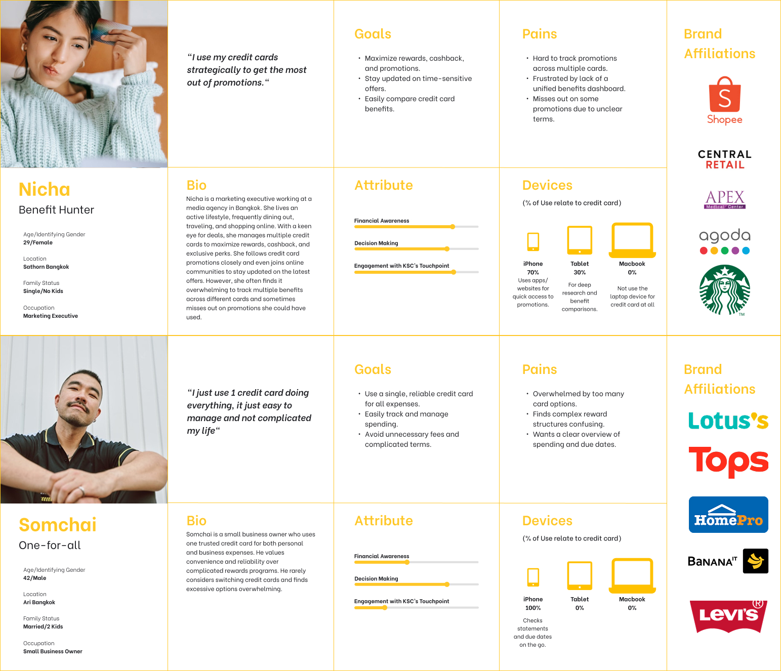
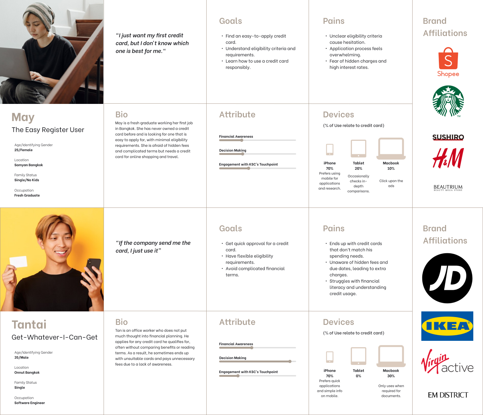
To gain deeper customer insights, I developed an initial user typology through in-depth discussions with the client, using it as a working hypothesis to shape and refine our research questions. By categorizing users based on their behaviors, motivations, and decision-making processes, we can better understand their needs and expectations. This approach ensures that our investigation is not only structured but also highly relevant to the real-world experiences of different customer segments. Rather than making assumptions, this framework allows us to validate key insights through targeted research, helping to uncover pain points, preferences, and opportunities for improvement. By integrating these findings into the design process, we can create solutions that align with user behaviors, enhance engagement, and provide a seamless experience. Ultimately, this user typology serves as a foundation for refining our strategy, ensuring that every touchpoint is optimized for clarity, usability, and value.
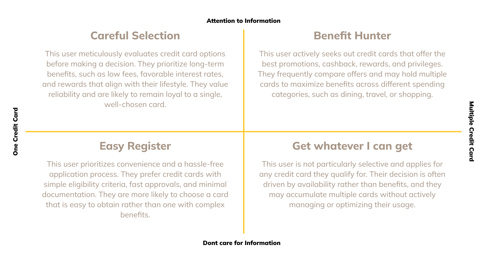
The typology functioned as a proto-persona, providing a foundational framework for shaping initial discussions and guiding the research approach. By categorizing users based on preliminary insights, it helped establish assumptions about customer behaviors, motivations, and decision-making processes. This proto-persona was then used to define and refine research questions, ensuring they were aligned with real user needs. Additionally, it played a crucial role in determining the appropriate sample size and participant selection for the study, ensuring a diverse yet relevant representation of the target audience. This structured approach allowed us to move beyond broad assumptions and focus on validating insights through direct engagement with users.
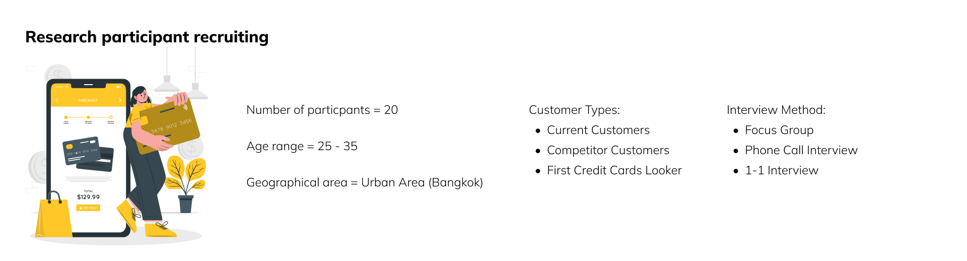
The participants were recruited with a focus on Bangkok, as it represents the largest concentration of Krungsri Consumer’s customer base. By prioritizing this location, we ensured that the study captured insights from the most relevant and engaged users. Bangkok's diverse demographic and high financial product adoption rate provided a rich pool of participants, allowing us to gather meaningful data that reflects the behaviors, preferences, and expectations of the majority of customers. This strategic recruitment approach helped ensure that our findings were both impactful and actionable, directly informing the design and development of the new corporate website.
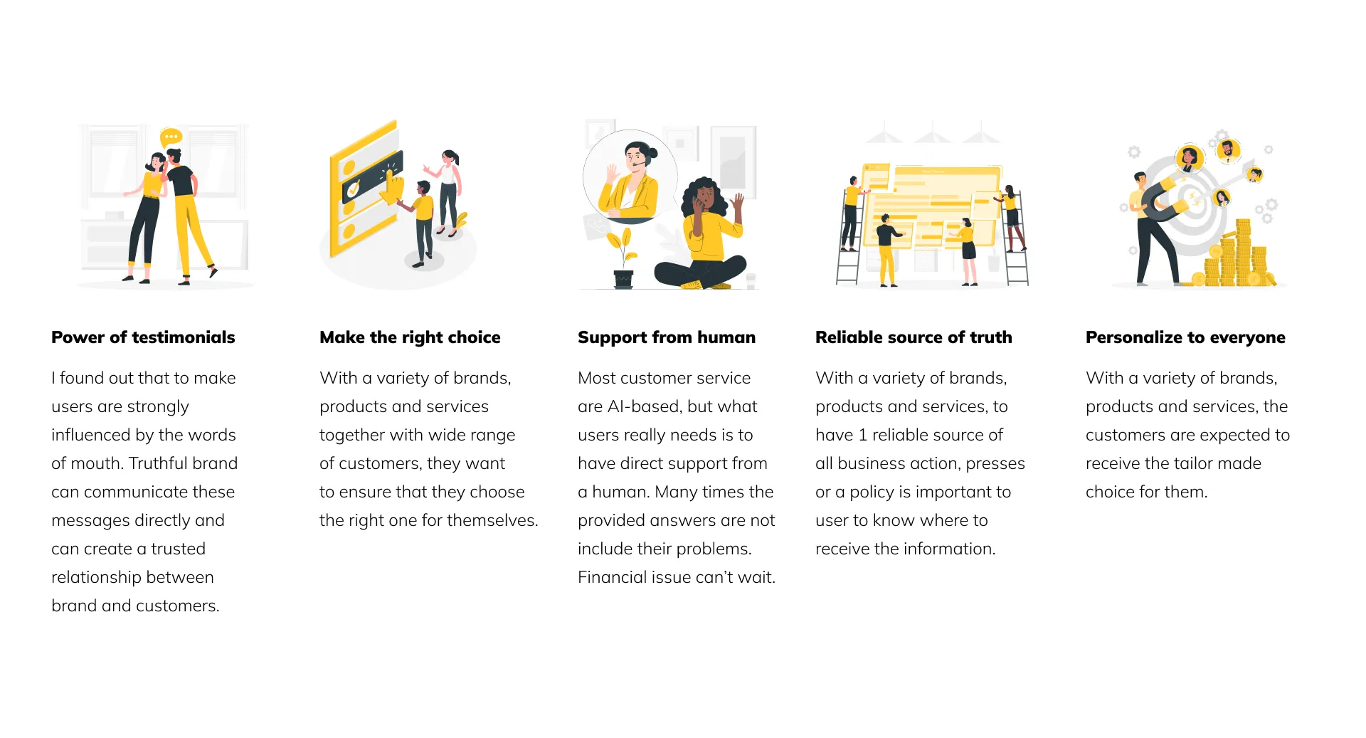
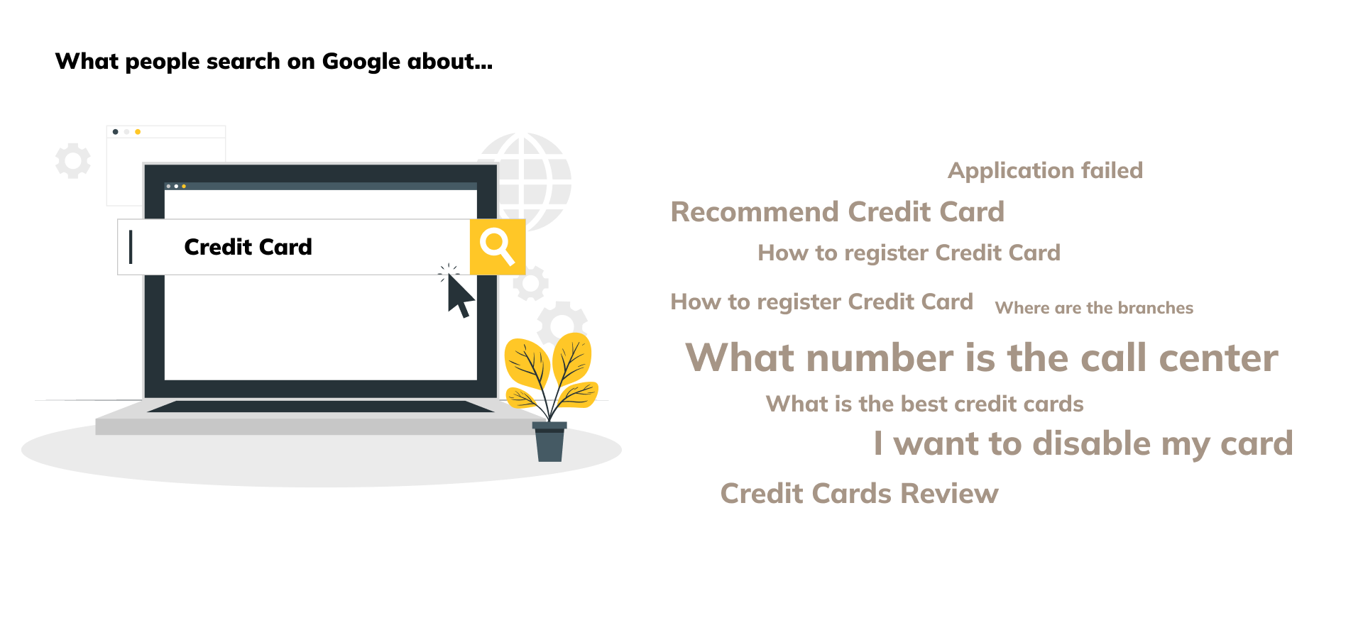
Since the touchpoint I am designing is a website, I conducted an analysis of keyword inquiries online to gain deeper insights into what users are actively searching for. This approach helps identify the most common questions, concerns, and topics of interest related to Krungsri Consumer. By understanding search behavior, I can align the website’s content, structure, and functionalities with user expectations.
This keyword analysis provides valuable data on customer intent, revealing whether users are primarily looking for promotions, application processes, customer support, or financial education. It also helps pinpoint pain points in the current digital experience, allowing us to address gaps and improve usability. By leveraging these insights, I ensure that the website serves as an effective touchpoint, not just a corporate platform, but a tool that meets user needs, enhances discoverability, and improves engagement.
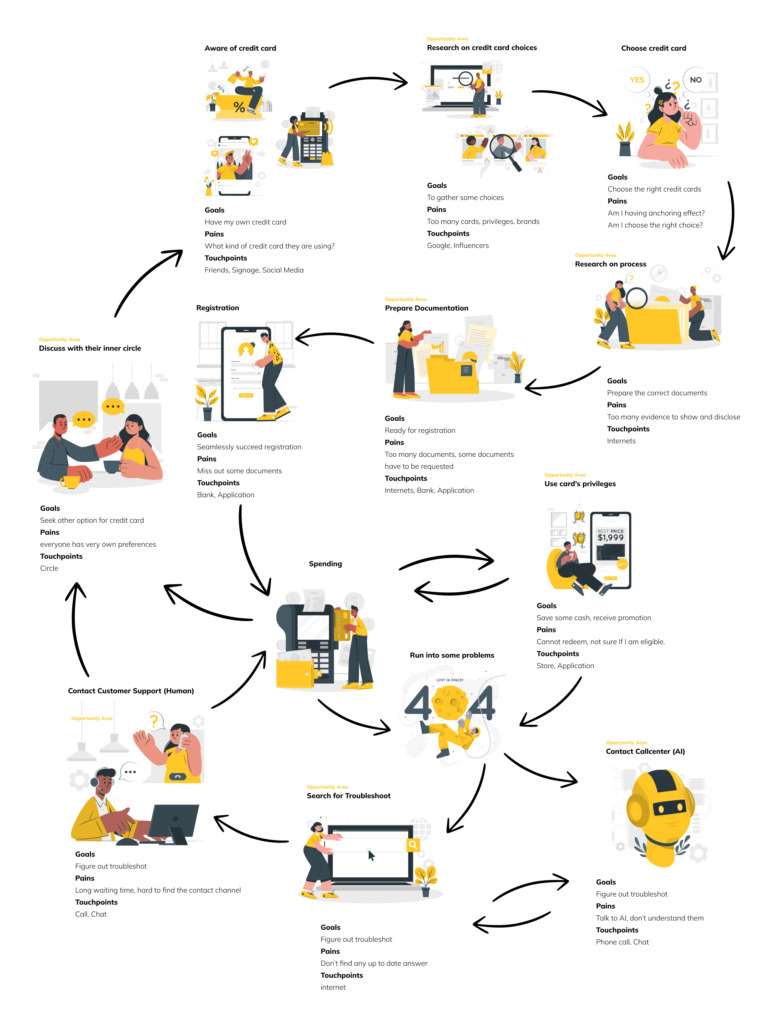
I developed a rich visual representation of the service lifecycle of a credit card customer, mapping out each stage of their journey from awareness to long-term engagement. This visual framework helps illustrate how customers interact with the service at different touchpoints, highlighting key moments that influence their decisions and experiences.
The lifecycle includes initial discovery, where users learn about credit card options, followed by the application process, where ease of registration and approval speed play a crucial role. Next comes onboarding and activation, ensuring a smooth first experience with the card. The active usage phase focuses on spending behavior, rewards optimization, and customer engagement with promotions. The lifecycle also considers issue resolution, covering customer service interactions, lost card situations, and fraud concerns. Finally, it includes renewal or exit, where customers decide whether to continue using the card, upgrade, or switch providers.
By visualizing this lifecycle, I ensure that our design decisions align with user needs at every stage, creating a website that not only informs but also supports and enhances the customer experience throughout their credit card journey.
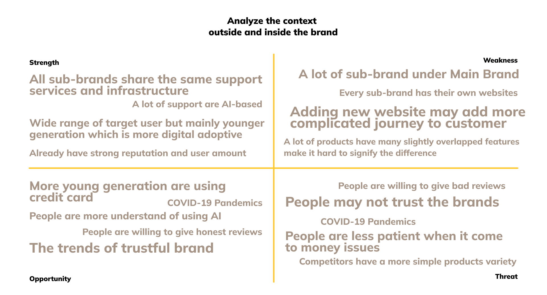
With multiple brands under Krungsri Consumer (KSC), users often navigate directly to sub-brand websites, bypassing the main corporate site entirely. This behavior results in a high drop-off rate from the corporate site and a lack of awareness about other financial products and services available under KSC.
As a consequence, users may miss out on better-suited credit card or financial solutions, leading to reduced cross-brand engagement and lower conversion opportunities.
This brand fragmentation creates an inconsistent user journey where customers interact with KSC brands in isolation, without realizing the full suite of options available to them. The absence of a unified digital experience means that users only engage with the brand they already know, rather than discovering alternatives that might better align with their financial needs.
I conducted a SWOT analysis to gain a comprehensive understanding of Krungsri Consumer’s credit card services and its digital presence. This analysis helps identify key strengths that can be leveraged, weaknesses that need to be addressed, opportunities for improvement, and potential threats that could impact the effectiveness of the new website. By mapping these factors, I can align the website design with business objectives and user expectations, ensuring it effectively communicates Krungsri Consumer’s value while addressing customer pain points. The SWOT framework also helps in prioritizing strategic decisions, ensuring that the new digital touchpoint not only enhances brand visibility but also integrates seamlessly into the customer journey.
To better segment the target audience, I categorized the personas into two groups:
These users already own a Krungsri Consumer credit card and engage with it based on their spending habits, financial goals, and lifestyle needs. Their interactions with the brand vary—from those who actively track promotions to those who prefer a hassle-free credit card experience. Understanding their behaviors, challenges, and motivations allows us to refine the website experience to improve retention, engagement, and satisfaction.
These users are either applying for their first Krungsri Consumer (KSC) credit card or looking to expand their financial flexibility by adding another card to their portfolio. Their needs vary—some are first-time applicants unfamiliar with credit card usage, while others seek quick approvals, minimal eligibility barriers, or better financial options. Understanding their motivations, pain points, and behaviors ensures that the website provides a seamless, informative, and conversion-driven experience that simplifies the application process and reduces drop-offs.
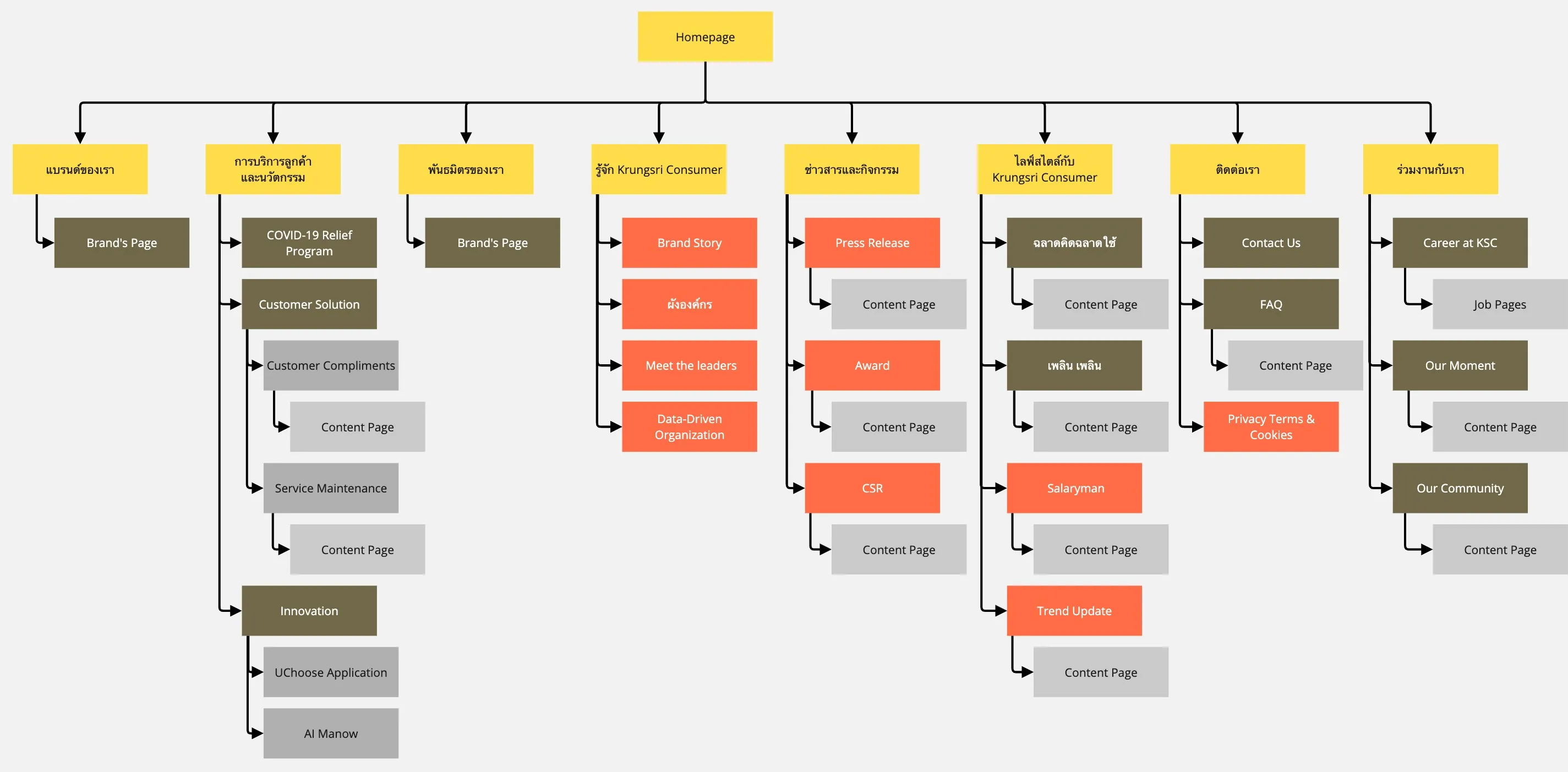
To bring clarity, consistency, and usability to the Krungsri Consumer digital experience, I developed a strategically structured sitemap that aligns with both user needs and business goals. The sitemap serves as the foundation for a website that not only functions as a traditional corporate platform but also integrates multiple layers of functionality, from product discovery to customer support.
At the top level, the sitemap introduces five core sections: Credit Cards, Help & Support, Financial Lifestyle, About Us, and Apply Now. These are designed to cater to both new users looking to explore or apply for a credit card, and existing customers seeking support or benefits information.
The Credit Cards section acts as a central comparison hub, aggregating offerings from all five sub-brands. It features filters, smart recommendations, and clear eligibility indicators to help users find the most suitable option without navigating away.
Help & Support functions as a troubleshooting center, providing FAQs, contact options, card tracking, and knowledge base articles across all brands, reducing fragmentation and enhancing customer confidence.
Financial Lifestyle introduces an editorial layer, offering blogs, guides, and tips on money management, credit card usage, and spending behaviour, positioning Krungsri Consumer as a financial partner, not just a provider.
About Us goes beyond a typical corporate profile. It is designed to build trust, showcasing leadership, innovation, and the backing of MUFG, reinforcing brand strength and credibility.

To ensure the sitemap truly reflected both user mental models and organizational priorities, I conducted a card sorting exercise with subject matter experts (SMEs) from across Krungsri Consumer’s departments including product, marketing, customer service, and digital strategy. The goal was to collaboratively uncover how internal stakeholders structure information, categorize services, and prioritize features from a business standpoint.
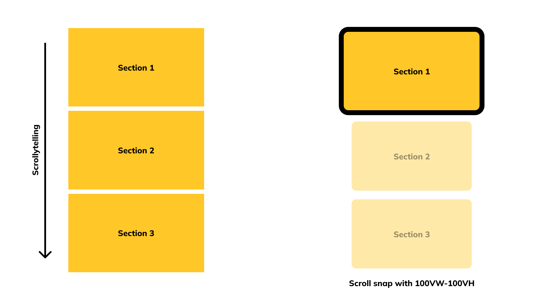
As the new Krungsri Consumer website will be information-dense, especially with the need to house product details, corporate content, support tools, and lifestyle education, it’s essential that the interaction design helps users process information with ease and clarity. To address this, I designed the site to utilize scroll-based interaction patterns such as scroll snapping and scrollytelling.
The scroll snap technique ensures that each section presents one focused topic per screen, allowing users to digest content in clear, manageable blocks. This reduces cognitive overload and creates a smoother, more guided browsing experience, particularly important for mobile users navigating long, content-heavy pages.
Additionally, scrollytelling brings the narrative to life by combining motion, transitions, and visual storytelling as users scroll. This method is used to introduce product features, explain complex processes (like card comparison or application steps), and highlight key moments in the customer journey, all while keeping engagement high.
These interaction techniques are not just aesthetic, they’re functional. They help segment dense information into bite-sized, visually-led moments, allowing users to stay oriented, follow the storyline, and feel more in control of their browsing experience. Together, scroll snap and scrollytelling create a site that feels intuitive, immersive, and supportive—perfect for a brand like KSC that needs to inform, educate, and convert with confidence.
